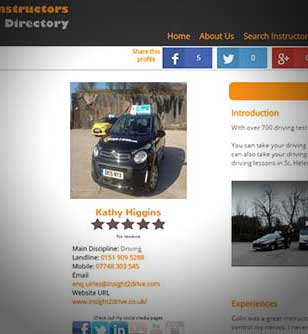
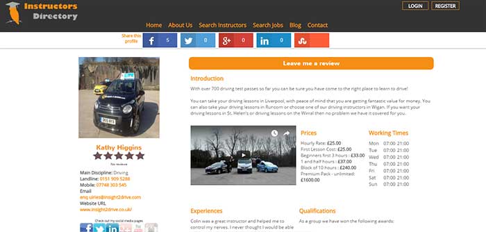
We are continually working on ways to improve the visibility of instructors who register on our directory across the internet. Our new profile page design has been implemented to both improve engagement from those viewing and to enhance the page ranking on Google.
Before we began designing the new profile page we did some research to determine what the best and most effective layout for a profile page could be. Through research on both eye-tracking and general user feedback the following facts were determined.

The first part of a web page our eyes generally focus on is the top left corner. So we decided that this would be the perfect place to put an instructor's profile picture, as profile pictures can tell a lot about someone or a business rather quickly.
A study in 2008 revealed that on average only 28% of text is read. That in fact most people don't read but scan a page. Eye-tracking research shows that users will often read website content in an F shaped pattern; two horizontal stripes then a vertical strip. This was confirmed by another study, which can be found here http://www.videodim.com/Eye%20gaze%20Patterns.html
![]() To make the most of this we decided to place the instructors' introduction to the right of their profile picture. As soon as a visitor to the profile has looked at the profile picture they will then begin to read the introduction, giving the instructor a chance to sell himself.
To make the most of this we decided to place the instructors' introduction to the right of their profile picture. As soon as a visitor to the profile has looked at the profile picture they will then begin to read the introduction, giving the instructor a chance to sell himself.
Generally people will read from the left side to the right side. This is the reason why the left side will often get more attention. In another study it was discovered that 69% of a web user's time is spent viewing the left half of a page, while the remaining 31% is viewing the right half.
So, to work with this, below the profile picture we included the instructor's name, ranking, disciplines, contact details, social media links and location details. This gives the visitor to the page all the information they need to get in contact with the instructor.
This is common knowledge and we have focused on doing just that. By displaying the most important information near the top we are increasing the likelihood that the visitor will be engaged and will choose to continue reading down the rest of the profile page.

Along with the improved profile pages we also added a number of additional options:
 Added additional social links. Instructors can now link to their YouTube channel and Instagram page.
 Added a 'Secondary Discipline' option. This will help instructors who may fall into two different disciplines to be discovered and appear on more search results. (This is a premium account feature only).
 Added new 'SEO Options' section. To further promote the profile page on Google and help boost it's ranking to the first page, we have also included some additional SEO options that will allow an instructor to add additional keywords and phrases to their profile page, as well as choose a page title. (This is a premium account feature only).
Posted By: Mark Posted On: 14-Mar-2016
Views: 85534
